SERVCOP
Digital Design
Marketing & Strategy
Animation
Project Overview
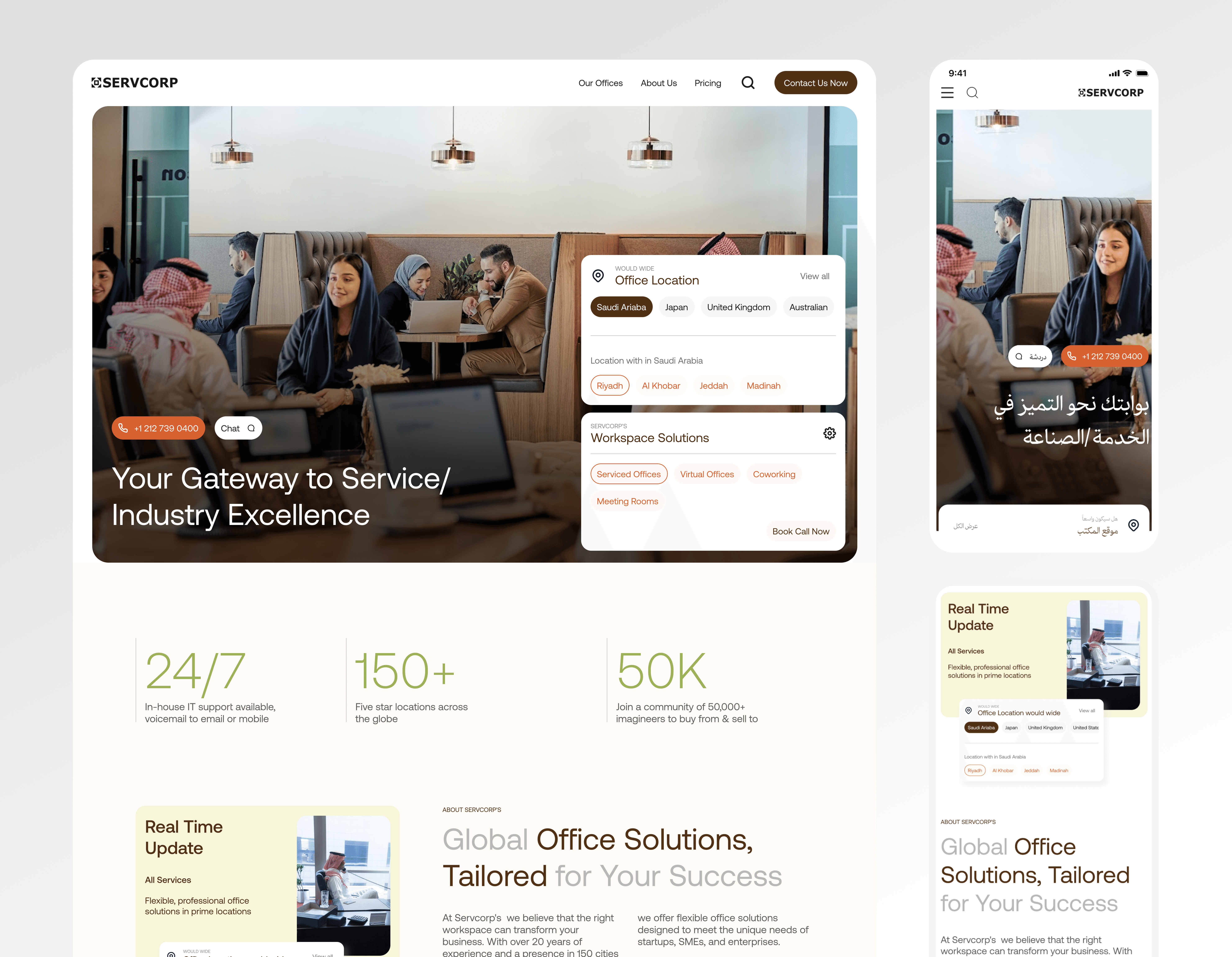
Redesigning the SERVCORP website, where i worked closely with the web marketing and other teams to understand their pain points. i also played a key role in supporting UI/UX governance, ensuring the design aligned with the business goals and user needs.
SERVCORP is a B2B office rental company with a global presence across countries like Australia, Japan, Saudi Arabia, India, and more. The goal of the website redesign is to modernize the user experience and increase engagement, ultimately supporting business growth and customer acquisition across all markets.

Technical Issues: - Severe performance issues with slow initial loading times - Heavy graphics causing extended load times - Non-functioning internal pages and dead links - Outdated design reminiscent of 1990s web aesthetics Design Issues:- - Aggressive color combinations causing visual fatigue - Overcrowded hero section with multiple competing calls-to-action - Text overlaid on images creating readability issues - Misaligned sections throughout the website - Congested graphics creating visual confusion - Animation overload during scroll interactions Content and Navigation Issues: - Excessive text in service sections (serviced offices, virtual offices, working space) - Poor content hierarchy makes information hard to understand - Location services limited to Saudi Arabia with poor international user consideration - Blog section lacking visual elements - Complex navigation structure impeding user journey


WHAT WE DO
Technical Issues: - Severe performance issues with slow initial loading times - Heavy graphics causing extended load times - Non-functioning internal pages and dead links - Outdated design reminiscent of 1990s web aesthetics Design Issues:- - Aggressive color combinations causing visual fatigue - Overcrowded hero section with multiple competing calls-to-action - Text overlaid on images creating readability issues - Misaligned sections throughout the website - Congested graphics creating visual confusion - Animation overload during scroll interactions Content and Navigation Issues: - Excessive text in service sections (serviced offices, virtual offices, working space) - Poor content hierarchy makes information hard to understand - Location services limited to Saudi Arabia with poor international user consideration - Blog section lacking visual elements - Complex navigation structure impeding user journey, Google Analytics: Through Google Analytics, we analyzed user behavior to identify friction points and weaknesses in the design. This insight allowed us to make informed, long-term improvements to the design direction.” User Personas Our target was simple: to find B2B users to test the existing website and gather their feedback. Research and Analysis 1. User Research: - Created 4 detailed user personas - Conducted competitive analysis - Identified industry best practices - Established benchmarks 2. Design Process: - Created design inspiration moodboards - Developed low-fidelity wireframes - Created two distinct design directions: - Illustration-based concept - Traditional page layouts - Established typography guidelines